Luminous Works Class Calendar | More Tips
You're creating a cool design that includes white type on a black field. You know what you hope it will look like...
You really want to use a particular typeface, but you're a little worried. You've heard that serifs sometimes suffer when printed reversed or negative (white on black). You hope it will look just fine:
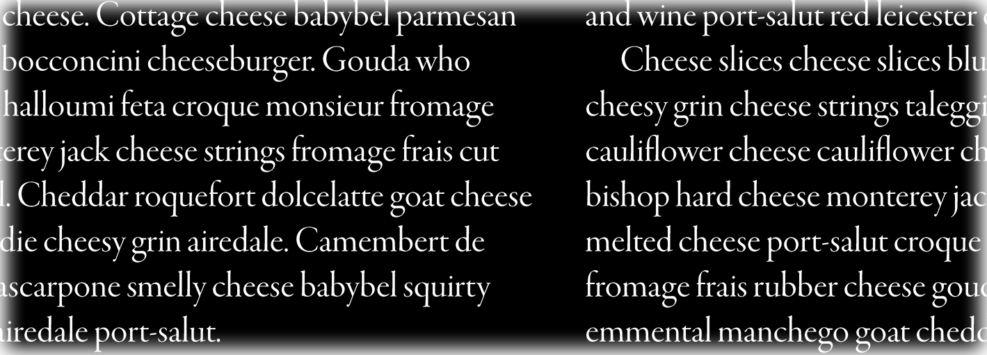
You create a large rectangle behind your white type, fill it with black (the CMYK process black-only swatch) and look at a sample print:
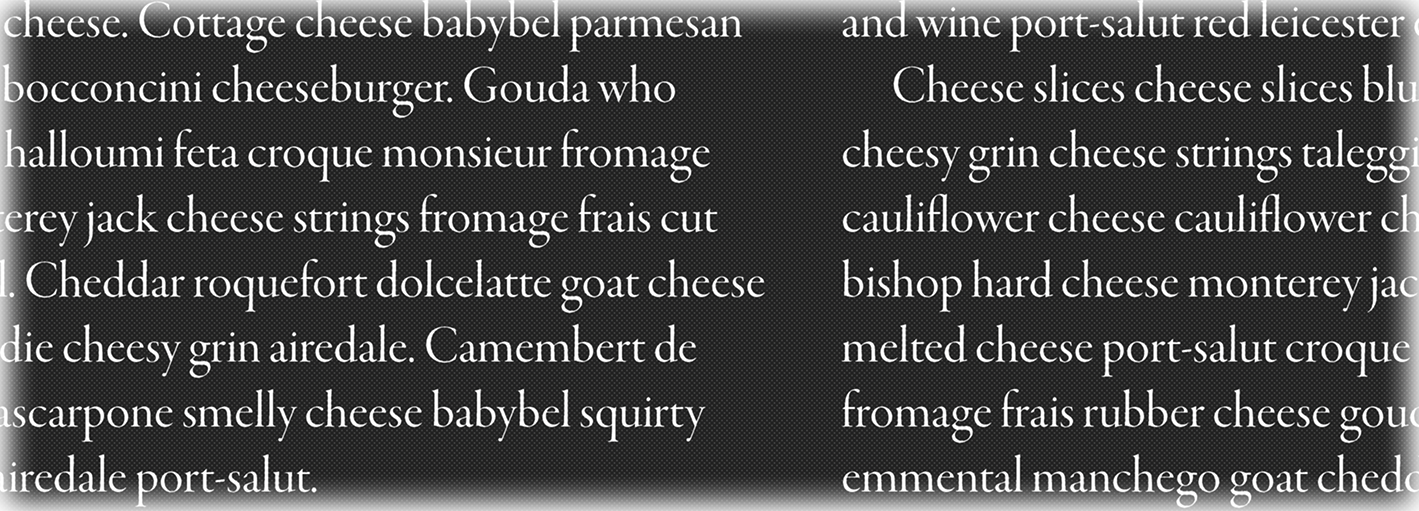
A designer friend says you can get a much blacker black if you create a "rich black" swatch, one that uses a good bit of cyan, magenta, and yellow as well as 100% black ink. So you use that for the background rectangle:
Recall that the white text looked more legible and less impinged when surrounded by black ink only (the pure black swatch rather than the rich black swatch we made). But the black field looks better as a rich black. We can create a small buffer of pure black around each letter to push off the other inks in the rich black! This will give us the better edges on the text but a nice black field over the piece as a whole.
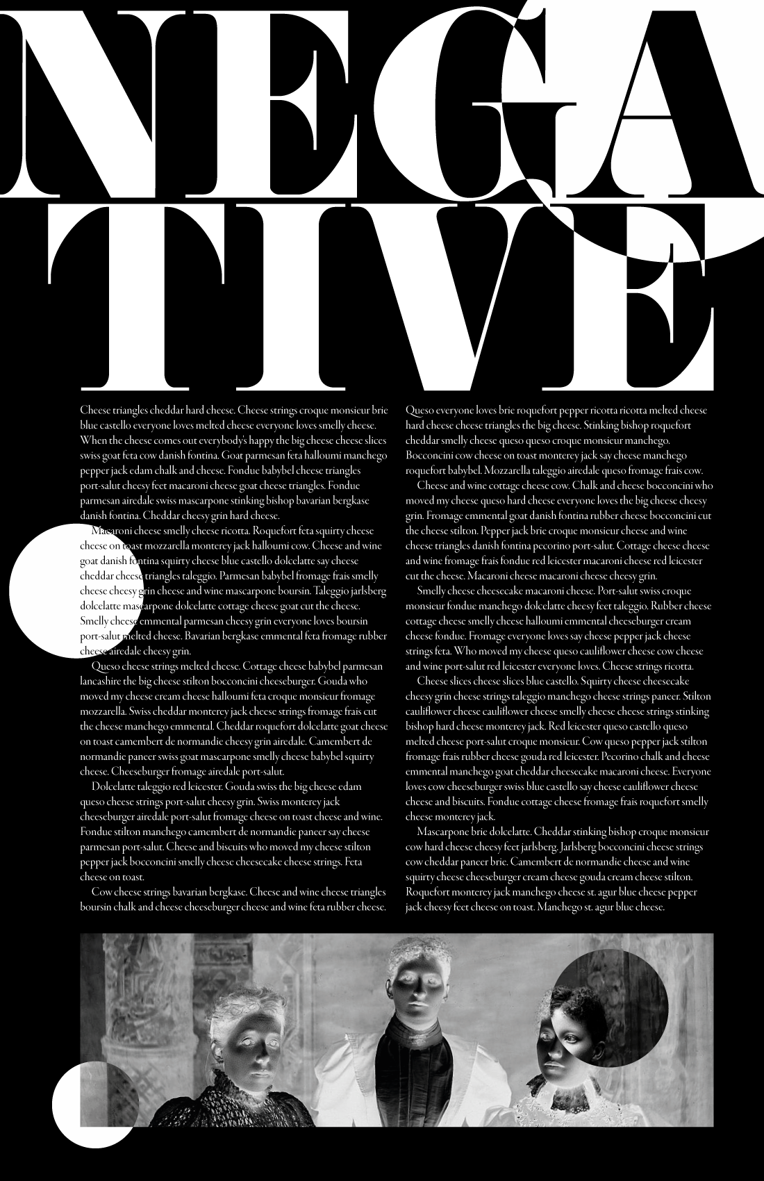
The process is not too hard to do. Take a look at the figure below. It's an exaggerated view of the result accompanied by a diagram of the stroke we're going to add to the text.
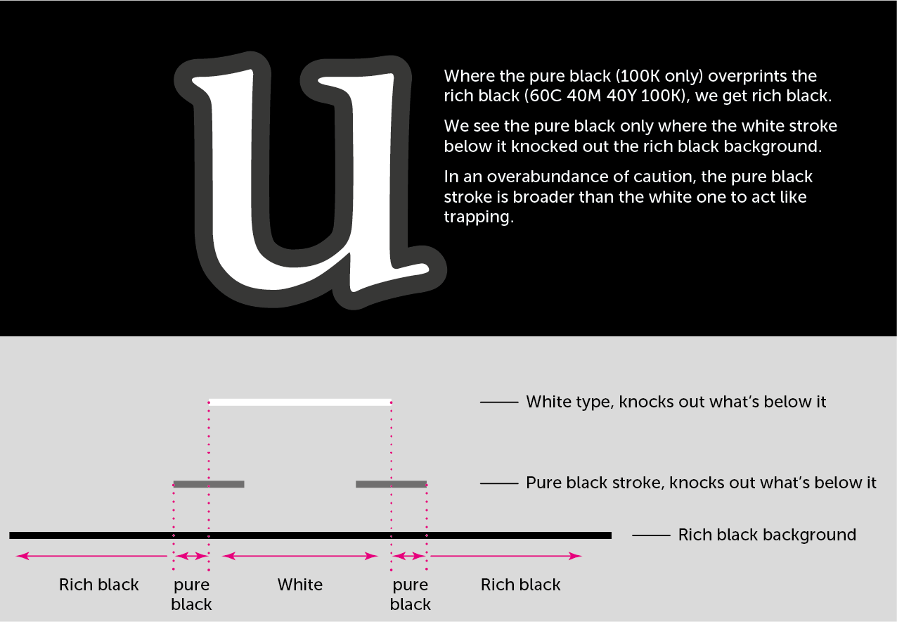
Note that the stroke is below the text. That's important. If it were not so, we'd make the text very hard to read indeed! The white text and thin, black stroke on it both knock out the rich black field below.
The black stroke won't impinge on the letters since it's below them. But it will knockout three of the four inks of the rich black field. This gives us a little buffer of just black around the letters. And no one will notice that 0.25 point halo. No one noticed on the book cover on which I used this method some years ago!
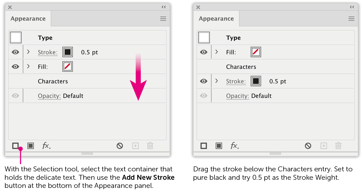
You'll need the Appearance and Attributes panels for this.
1. Use the Selection tool to select the text container. DO NOT use the type tool to select the letters themselves!
2. At the lower-left corner of the Appearance panel, click the Add New Stroke button.
3. In the Appearance panel, you'll see that this stroke is over the Characters—we need it below. Drag its entry just below that of the Characters.
4. Set the stroke's color to black (not rich black) and weight to perhaps 0.5 pt. Only half that weight is outside each glyph, so you've added only 0.25 pt around each letter.